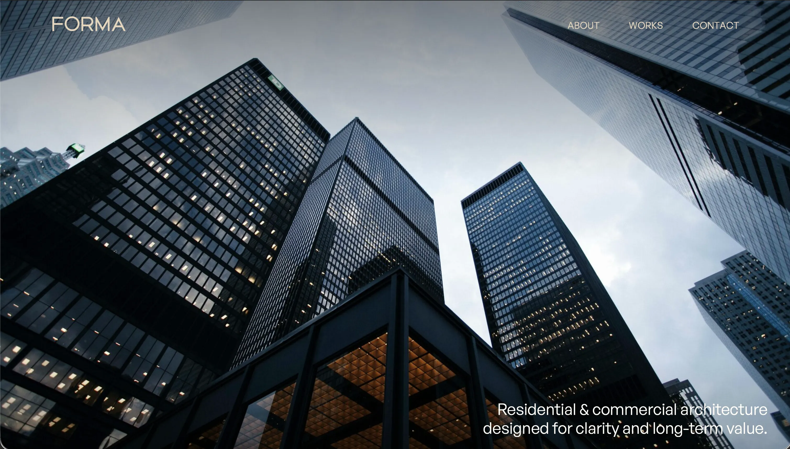
Forma
Forma
Role
Design & Frontend Engineering
Type
Self-initiated case study
Timeline
1 Week
Stack
Next.js 15 · React · TypeScript · GSAP · Lenis · Tailwind CSS
Brief
Premium architecture studio site
Live
forma.sujen.co
Forma started as a simple question I kept coming back to: how do you make a studio feel calm, premium, and trustworthy before a visitor has even read much? I used a fictional architecture studio to explore that problem without the usual client constraints.
The Brief
Architecture studios are judged very quickly. People scan for taste, clarity, and a feeling that the work is worth a conversation. If that first impression feels generic, the enquiry is probably gone before services or process matter.
I did not want it to become another image grid with better typography. The challenge was to make it feel spacious and considered, explain services without breaking the reading flow, and keep the motion controlled enough that it still felt credible on slower devices.
What This Case Study Proves
92
Performance
96
Accessibility
100
Best Practices
100
SEO
Desktop Lighthouse snapshot on the production build.
The first useful signal is technical: the visual direction did not have to come at the cost of a sluggish experience. The expensive part is bundle size, not runtime behaviour. Scrolling and animation do not block the main thread.
The second useful signal is process. Accessibility dropped to 96 because of a third-party library and a few contrast misses on secondary text. The fixes were straightforward once surfaced, which is exactly why they should be caught earlier and backed by automation.
What it does not prove is business lift. On a real engagement, the next layer would be scroll-depth tracking, session recordings, and enquiry attribution to learn which moments actually strengthen intent instead of just improving perception.
What I Changed
Spacing
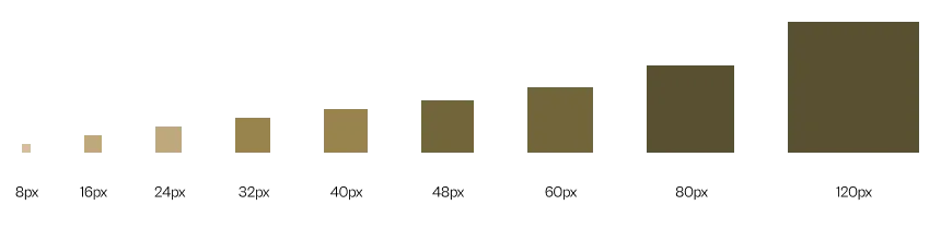
I reduced the system to three spacing modes: tight inside modules, generous between sections, and wide desktop margins. That simplicity does most of the work. The page feels curated instead of crowded.
Colour
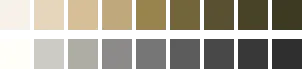
Warm earth tones on a cream base let the work feel tactile without becoming decorative for its own sake. One restrained colour family kept the site coherent and expensive-looking.
Typography
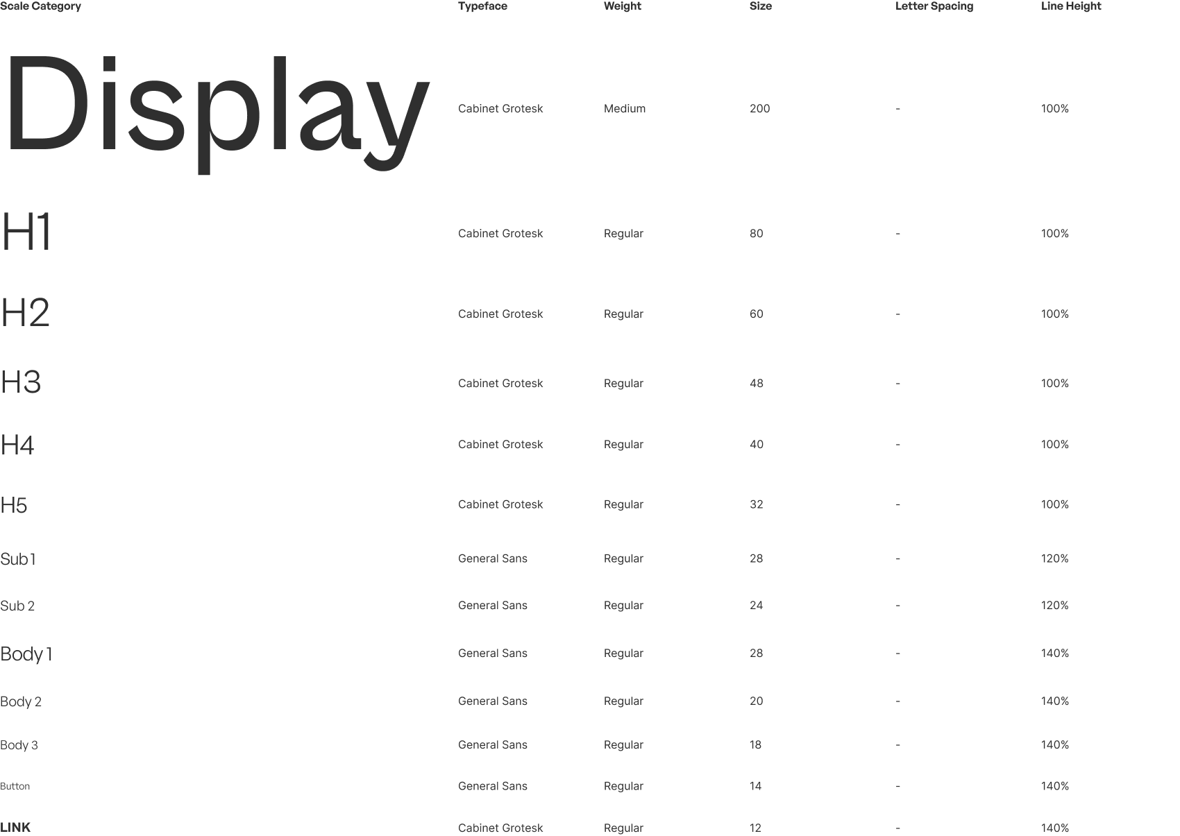
Two fonts, one role each. CabinetGrotesk carries tone and hierarchy. GeneralSans handles longer reading. That split kept the visual language clear and sped up implementation decisions.
A Better Way To Explain Services
Why
I tested tabs first. They worked, but they interrupted the scan. The visitor had to stop, choose, and reorient. The scroll-driven version keeps service information moving at the pace the visitor already set, which makes the page feel easier to understand.
How
Under the hood, each accordion item keeps its GSAP timeline in a ref and exposes imperative play and pause methods. ScrollTrigger talks to those directly, so the interaction stays smooth without React trying to re-render on every scroll tick.
Depth Without A Gallery Feel
Why
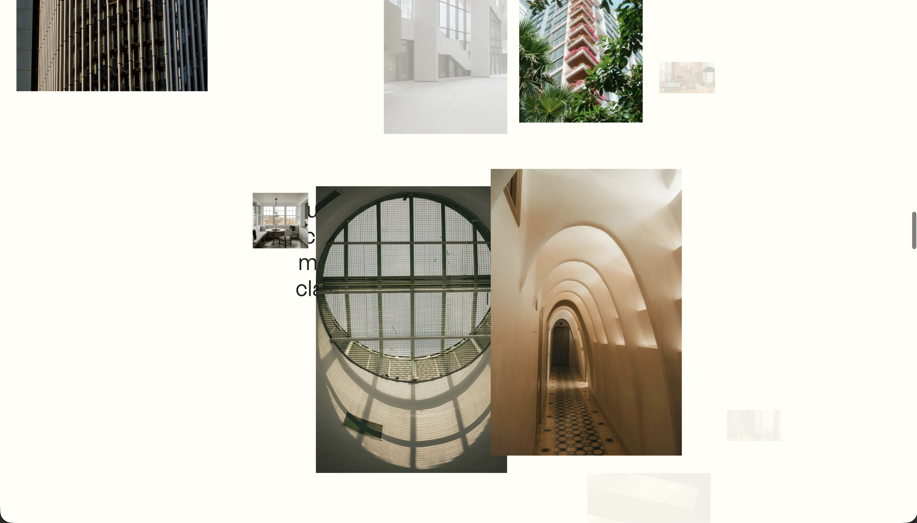
Static image grids can make premium work feel interchangeable. Layering images at different scroll speeds gave the site a sense of depth, so browsing it feels closer to moving through a space than flipping through a catalogue.
How
Each image combines scroll-driven depth, subtle cursor offset, and viewport-tied opacity. That is a lot of moving parts, but keeping the values in refs and writing styles directly meant the effect stayed lightweight enough to feel intentional rather than fragile.
Mobile Needed Its Own Experience
Why
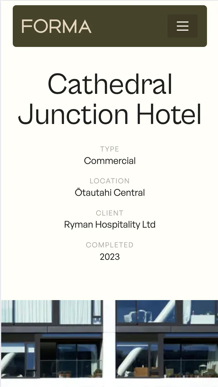
Desktop relies on hover, cursor parallax, and scroll-linked interaction. None of that maps cleanly to touch. Shrinking the desktop site would have created a compromised mobile version instead of a good one.
How
A breakpoint hook swaps whole component implementations, not just visibility. Mobile never mounts the desktop listeners or timelines. It gets simpler motion, larger tap targets, and only the code it actually needs.
Why It Still Feels Fast
Premium motion only helps if the site still feels easy to use. Every technical choice here was made to protect that feeling.
Motion supports reading instead of distracting from it.
Scroll position, parallax offsets, and accordion progress live in refs and update imperatively. React never re-renders during scroll, so the page keeps its calm, premium feel instead of fighting the visitor.
Only cheap properties animate.
Every animation stays on transform and opacity. No width, height, top, or left changes, so motion stays smooth on mid-range hardware instead of degrading into jank.
Heavy sections go quiet off-screen.
Off-screen sections pause their GSAP timelines and disconnect scroll listeners. The heavier visual moments only run when they are helping the visitor, not all the time.
Honest Trade-offs
Raw image control over framework convenience.
Next/Image makes responsive delivery easier, but its wrapper gets in the way of direct transform control. I used native img elements to keep the motion system simple, then would add a custom image pipeline in production to recover srcset and lazy-loading gains.
This is concept work, not commercial proof.
There was no live client, no stakeholder feedback loop, and no analytics. The decisions are reasoned, but a real engagement would need session recordings, scroll-depth tracking, and enquiry metrics to prove the experience helps conversion rather than just perception.
Some motion should earn its keep more aggressively.
The accordion and content reveals support scanning. Some of the denser parallax treatment is closer to brand expression than proven UX lift. On a client project, I would trim anything that does not clearly strengthen comprehension, trust, or enquiry intent.
What I'd Do In Production
Keep the system work early.
Two fonts, one colour family, and three spacing increments made the whole build faster and more consistent. On a client engagement, I would formalize that system even sooner to make reviews and future pages cheaper.
Trim anything that does not earn trust.
The parallax and accordion support how the page is read. The 3D testimonial carousel adds less business value than complexity. In production, I would cut or simplify any effect that does not clearly improve perception or understanding.
Start mobile as its own brief.
Treating touch as a separate interaction model took more time, but produced a better result. I would make that split explicit in planning rather than discovering it mid-build.
Audit accessibility earlier.
A few small misses created a measurable Lighthouse drop. That is exactly the kind of issue that should be caught by process, not by cleanup at the end.
Keep the framework boundary clean.
Keeping animation state out of React was not a workaround. It was the reason the page stayed smooth. I would keep that boundary on any build where motion quality matters.